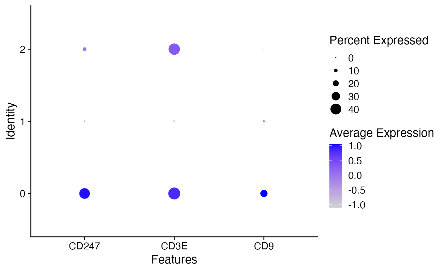
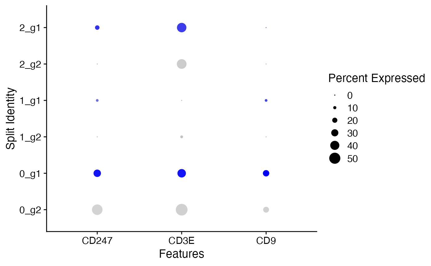
Intuitive way of visualizing how feature expression changes across different identity classes (clusters). The size of the dot encodes the percentage of cells within a class, while the color encodes the AverageExpression level across all cells within a class (blue is high).
DotPlot(
  object,
  features,
  assay = NULL,
  cols = c("lightgrey", "blue"),
  col.min = -2.5,
  col.max = 2.5,
  dot.min = 0,
  dot.scale = 6,
  idents = NULL,
  group.by = NULL,
  split.by = NULL,
  cluster.idents = FALSE,
  scale = TRUE,
  scale.by = "radius",
  scale.min = NA,
  scale.max = NA
)
Arguments
- object
Seurat object
- features
Input vector of features, or named list of feature vectors if feature-grouped panels are desired (replicates the functionality of the old SplitDotPlotGG)
- assay
Name of assay to use, defaults to the active assay
- cols
Colors to plot: the name of a palette from
RColorBrewer::brewer.pal.info, a pair of colors defining a gradient, or 3+ colors defining multiple gradients (if split.by is set)- col.min
Minimum scaled average expression threshold (everything smaller will be set to this)
- col.max
Maximum scaled average expression threshold (everything larger will be set to this)
- dot.min
The fraction of cells at which to draw the smallest dot (default is 0). All cell groups with less than this expressing the given gene will have no dot drawn.
- dot.scale
Scale the size of the points, similar to cex
- idents
Identity classes to include in plot (default is all)
- group.by
Factor to group the cells by
- split.by
A factor in object metadata to split the plot by, pass 'ident' to split by cell identity see
FetchDatafor more details- cluster.idents
Whether to order identities by hierarchical clusters based on given features, default is FALSE
- scale
Determine whether the data is scaled, TRUE for default
- scale.by
Scale the size of the points by 'size' or by 'radius'
- scale.min
Set lower limit for scaling, use NA for default
- scale.max
Set upper limit for scaling, use NA for default
Value
A ggplot object
See also
Examples
data("pbmc_small")
cd_genes <- c("CD247", "CD3E", "CD9")
DotPlot(object = pbmc_small, features = cd_genes)
#> Warning: Scaling data with a low number of groups may produce misleading results

pbmc_small[['groups']] <- sample(x = c('g1', 'g2'), size = ncol(x = pbmc_small), replace = TRUE)
DotPlot(object = pbmc_small, features = cd_genes, split.by = 'groups')
