Seurat - Guided Clustering Tutorial
Compiled: April 28, 2026
Source:vignettes/pbmc3k_tutorial.Rmd
pbmc3k_tutorial.RmdSet up the Seurat object
For this tutorial, we will be analyzing a dataset of Peripheral Blood Mononuclear Cells (PBMC) freely available from 10X Genomics. There are 2,700 single cells that were sequenced on the Illumina NextSeq 500. The raw data can be found here.
We start by reading in the data. The Read10X() function
reads in the output of the cellranger
pipeline from 10X, returning a unique molecular identified (UMI) count
matrix. The values in this matrix represent the number of molecules for
each feature (i.e. gene; row) that are detected in each cell (column).
Note that more recent versions of cellranger now also output using the
h5
file format, which can be read in using the
Read10X_h5() function in Seurat.
We next use the count matrix to create a Seurat object.
The object serves as a container that contains both data (like the count
matrix) and analysis (like PCA, or clustering results) for a single-cell
dataset. For more information, check out the docs for
SeuratObject or the section on
object interaction in our list of essential commands. For example,
in Seurat v5, the count matrix is stored in
pbmc[["RNA"]]$counts.
library(dplyr)
library(Seurat)
library(patchwork)

# Load the PBMC dataset
pbmc.data <- Read10X(data.dir = "/brahms/mollag/practice/filtered_gene_bc_matrices/hg19/")
# Initialize the Seurat object with the raw (non-normalized data).
pbmc <- CreateSeuratObject(counts = pbmc.data, project = "pbmc3k", min.cells = 3, min.features = 200)
pbmc
## An object of class Seurat
## 13714 features across 2700 samples within 1 assay
## Active assay: RNA (13714 features, 0 variable features)
## 1 layer present: countsWhat does data in a count matrix look like?
# Lets examine a few genes in the first thirty cells
pbmc.data[c("CD3D", "TCL1A", "MS4A1"), 1:30]
## 3 x 30 sparse Matrix of class "dgCMatrix"##
## CD3D 4 . 10 . . 1 2 3 1 . . 2 7 1 . . 1 3 . 2 3 . . . . . 3 4 1 5
## TCL1A . . . . . . . . 1 . . . . . . . . . . . . 1 . . . . . . . .
## MS4A1 . 6 . . . . . . 1 1 1 . . . . . . . . . 36 1 2 . . 2 . . . .The . values in the matrix represent 0s (no molecules
detected). Since most values in an scRNA-seq matrix are 0, Seurat uses a
sparse-matrix representation whenever possible. This results in
significant memory and speed savings for Drop-seq/inDrop/10x data.
dense.size <- object.size(as.matrix(pbmc.data))
dense.size
## 709591472 bytes
sparse.size <- object.size(pbmc.data)
sparse.size
## 29905192 bytes
dense.size/sparse.size## 23.7 bytes
Standard pre-processing workflow
The steps below encompass the standard pre-processing workflow for scRNA-seq data in Seurat. These represent the selection and filtration of cells based on QC metrics, data normalization and scaling, and the detection of highly variable features.
QC and selecting cells for further analysis
Seurat allows you to easily explore QC metrics and filter cells based on any user-defined criteria. A few QC metrics commonly used by the community include:
- The number of unique genes detected in each cell.
- Low-quality cells or empty droplets will often have very few genes
- Cell doublets or multiplets may exhibit an aberrantly high gene count
- Similarly, the total number of molecules detected within a cell (correlates strongly with unique genes)
- The percentage of reads that map to the mitochondrial genome
- Low-quality / dying cells often exhibit extensive mitochondrial contamination
- We calculate mitochondrial QC metrics with the
PercentageFeatureSet()function, which calculates the percentage of counts originating from a set of features - We use the set of all genes starting with
MT-as a set of mitochondrial genes
# The [[ operator can add columns to object metadata. This is a great place to stash QC stats
pbmc[["percent.mt"]] <- PercentageFeatureSet(pbmc, pattern = "^MT-")
Where are QC metrics stored in Seurat?
- The number of unique genes and total molecules are automatically
calculated during
CreateSeuratObject()- You can find them stored in the object metadata
# Show QC metrics for the first 5 cells
head(pbmc@meta.data, 5)
## orig.ident nCount_RNA nFeature_RNA percent.mt
## AAACATACAACCAC-1 pbmc3k 2419 779 3.0177759
## AAACATTGAGCTAC-1 pbmc3k 4903 1352 3.7935958
## AAACATTGATCAGC-1 pbmc3k 3147 1129 0.8897363
## AAACCGTGCTTCCG-1 pbmc3k 2639 960 1.7430845
## AAACCGTGTATGCG-1 pbmc3k 980 521 1.2244898
In the example below, we visualize QC metrics, and use these to filter cells.
- We filter cells that have unique feature counts over 2,500 or less than 200
- We filter cells that have >5% mitochondrial counts
# Visualize QC metrics as a violin plot
VlnPlot(pbmc, features = c("nFeature_RNA", "nCount_RNA", "percent.mt"), ncol = 3)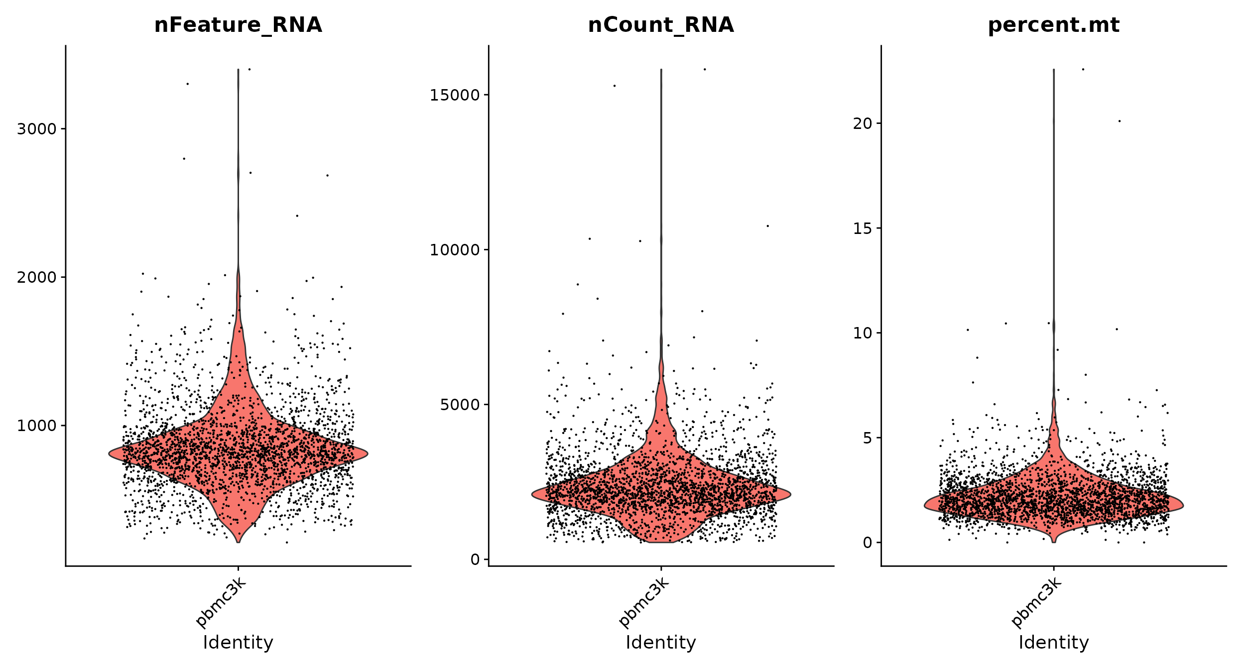
# FeatureScatter is typically used to visualize feature-feature relationships, but can be used
# for anything calculated by the object, i.e. columns in object metadata, PC scores etc.

plot1 <- FeatureScatter(pbmc, feature1 = "nCount_RNA", feature2 = "percent.mt")
plot2 <- FeatureScatter(pbmc, feature1 = "nCount_RNA", feature2 = "nFeature_RNA")
plot1 + plot2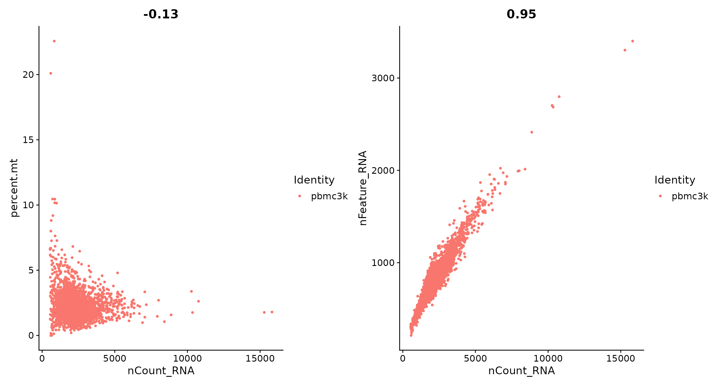
pbmc <- subset(pbmc, subset = nFeature_RNA > 200 & nFeature_RNA < 2500 & percent.mt < 5)Normalizing the data
After removing unwanted cells from the dataset, the next step is to
normalize the data. By default, we employ a global-scaling normalization
method “LogNormalize” that normalizes the feature expression
measurements for each cell by the total expression, multiplies this by a
scale factor (10,000 by default), and log-transforms the result. In
Seurat v5, normalized values are stored in
pbmc[["RNA"]]$data.
pbmc <- NormalizeData(pbmc, normalization.method = "LogNormalize", scale.factor = 10000)For clarity, in this previous line of code (and in future commands), we provide the default values for certain parameters in the function call. However, this isn’t required and the same behavior can be achieved with:
pbmc <- NormalizeData(pbmc)While this method of normalization is standard and widely used in
scRNA-seq analysis, global-scaling relies on an assumption that each
cell originally contains the same number of RNA molecules. We and others
have developed alternative workflows for the single cell preprocessing
that do not make these assumptions. For users who are interested, please
check out our SCTransform() normalization workflow. The
method is described in our paper,
with a separate vignette using Seurat here.
The use of SCTransform replaces the need to run
NormalizeData, FindVariableFeatures, or
ScaleData (described below.)
Identification of highly variable features (feature selection)
We next calculate a subset of features that exhibit high cell-to-cell variation in the dataset (i.e, they are highly expressed in some cells, and lowly expressed in others). We and others have found that focusing on these genes in downstream analysis helps to highlight biological signal in single-cell datasets.
Our procedure in Seurat is described in detail here, and improves
on previous versions by directly modeling the mean-variance relationship
inherent in single-cell data, and is implemented in the
FindVariableFeatures() function. By default, we return
2,000 features per dataset. These will be used in downstream analysis,
like PCA.
pbmc <- FindVariableFeatures(pbmc, selection.method = "vst", nfeatures = 2000)

# Identify the 10 most highly variable genes
top10 <- head(VariableFeatures(pbmc), 10)

# plot variable features with and without labels
plot1 <- VariableFeaturePlot(pbmc)
plot2 <- LabelPoints(plot = plot1, points = top10, repel = TRUE)
plot1 + plot2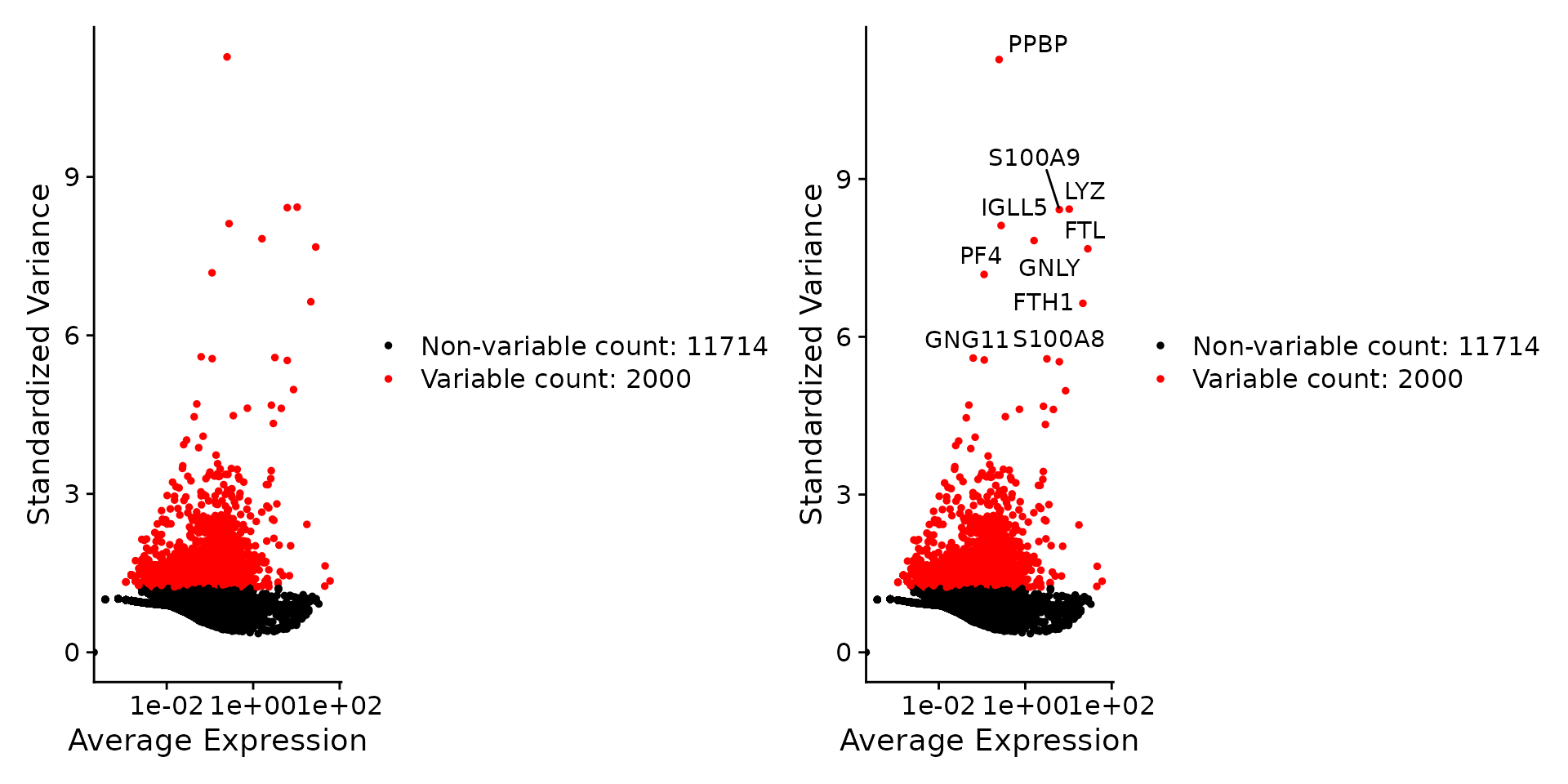
Scaling the data
Next, we apply a linear transformation (‘scaling’) that is a standard
pre-processing step prior to dimensional reduction techniques like PCA.
The ScaleData() function:
- Shifts the expression of each gene, so that the mean expression across cells is 0
- Scales the expression of each gene, so that the variance across
cells is 1
- This step gives equal weight in downstream analyses, so that highly-expressed genes do not dominate
The results of this are stored in
pbmc[["RNA"]]$scale.data. By default, only variable
features are scaled; you can specify the features argument
to scale additional features.
How can I remove unwanted sources of variation?
In Seurat, we also use the ScaleData() function to
remove unwanted sources of variation from a single-cell dataset. For
example, we could ‘regress out’ heterogeneity associated with (for
example) cell
cycle stage, or mitochondrial contamination i.e.:
pbmc <- ScaleData(pbmc, vars.to.regress = "percent.mt")SCTransform(). The method is described in our paper,
with a separate vignette using Seurat here.
As with ScaleData(), the function
SCTransform() also includes a vars.to.regress
parameter.
Perform linear dimensional reduction
Next we perform PCA on the scaled data. By default, only the
previously determined variable features are used as input, but can be
defined using features argument if you wish to choose a
different subset (if you do want to use a custom subset of features,
make sure you pass these to ScaleData first).
For the first principal components, Seurat outputs a list of genes with the most positive and negative loadings, representing modules of genes that exhibit either correlation (or anti-correlation) across single-cells in the dataset.
pbmc <- RunPCA(pbmc, features = VariableFeatures(object = pbmc))Seurat provides several useful ways of visualizing both cells and
features that define the PCA, including VizDimLoadings(),
DimPlot(), and DimHeatmap().
# Examine and visualize PCA results a few different ways
print(pbmc[["pca"]], dims = 1:5, nfeatures = 5)
## PC_ 1
## Positive: CST3, TYROBP, LST1, AIF1, FTL
## Negative: MALAT1, LTB, IL32, IL7R, CD2
## PC_ 2
## Positive: CD79A, MS4A1, TCL1A, HLA-DQA1, HLA-DQB1
## Negative: NKG7, PRF1, CST7, GZMB, GZMA
## PC_ 3
## Positive: HLA-DQA1, CD79A, CD79B, HLA-DQB1, HLA-DPB1
## Negative: PPBP, PF4, SDPR, SPARC, GNG11
## PC_ 4
## Positive: HLA-DQA1, CD79B, CD79A, MS4A1, HLA-DQB1
## Negative: VIM, IL7R, S100A6, IL32, S100A8
## PC_ 5
## Positive: GZMB, NKG7, S100A8, FGFBP2, GNLY
## Negative: LTB, IL7R, CKB, VIM, MS4A7
VizDimLoadings(pbmc, dims = 1:2, reduction = "pca")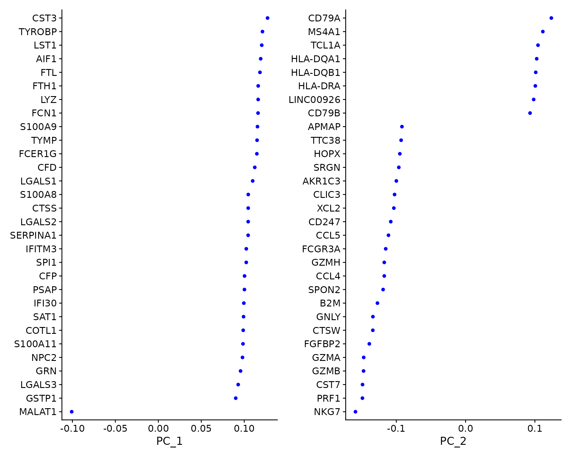
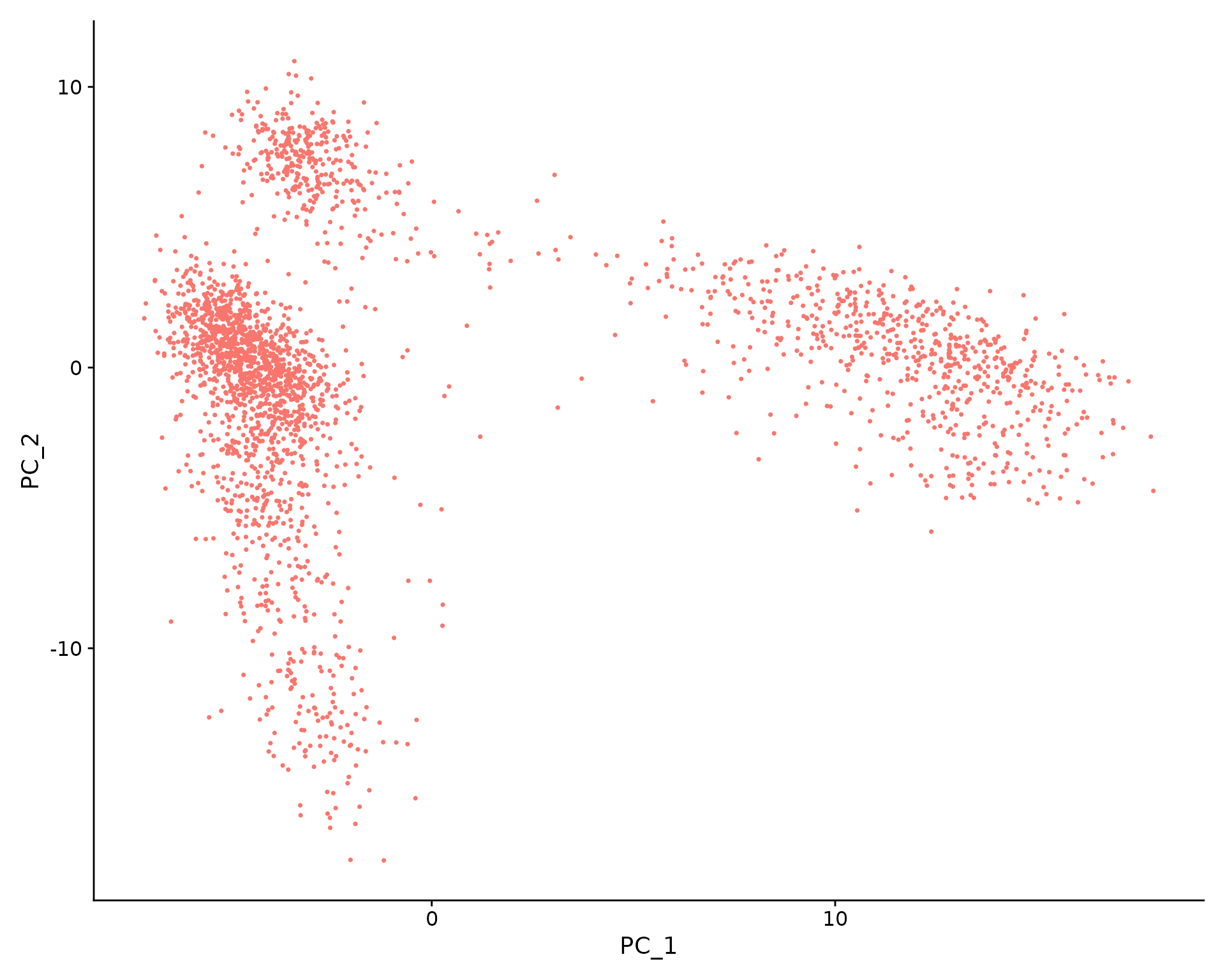
In particular, DimHeatmap() allows for easy exploration
of the primary sources of heterogeneity in a dataset, and can be useful
when trying to decide which PCs to include for further downstream
analyses. Both cells and features are ordered according to their PCA
scores. Setting cells to a number plots the ‘extreme’ cells
on both ends of the spectrum, which dramatically speeds plotting for
large datasets. Though clearly a supervised analysis, we find this to be
a valuable tool for exploring correlated feature sets.
DimHeatmap(pbmc, dims = 1, cells = 500, balanced = TRUE)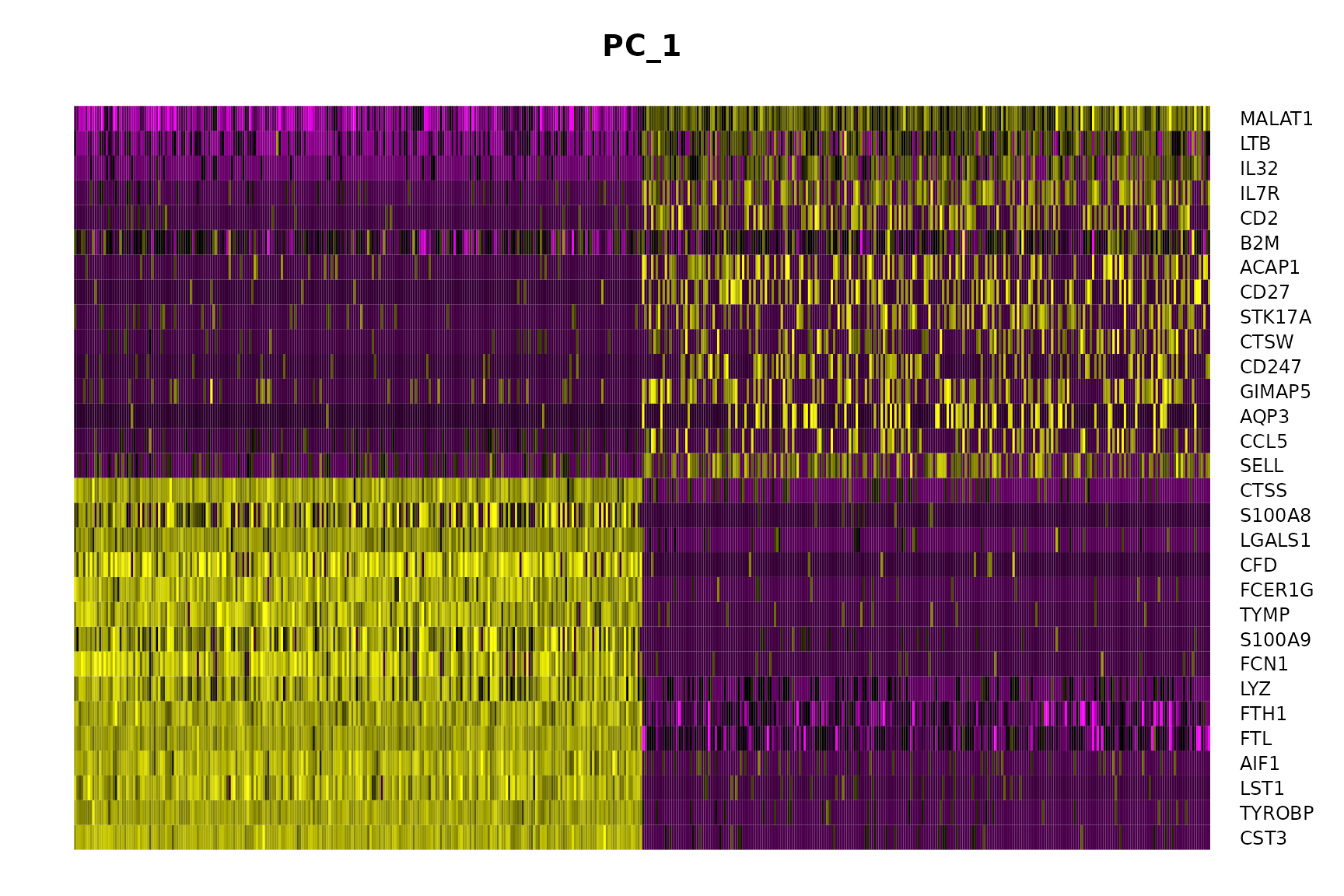
DimHeatmap(pbmc, dims = 1:15, cells = 500, balanced = TRUE)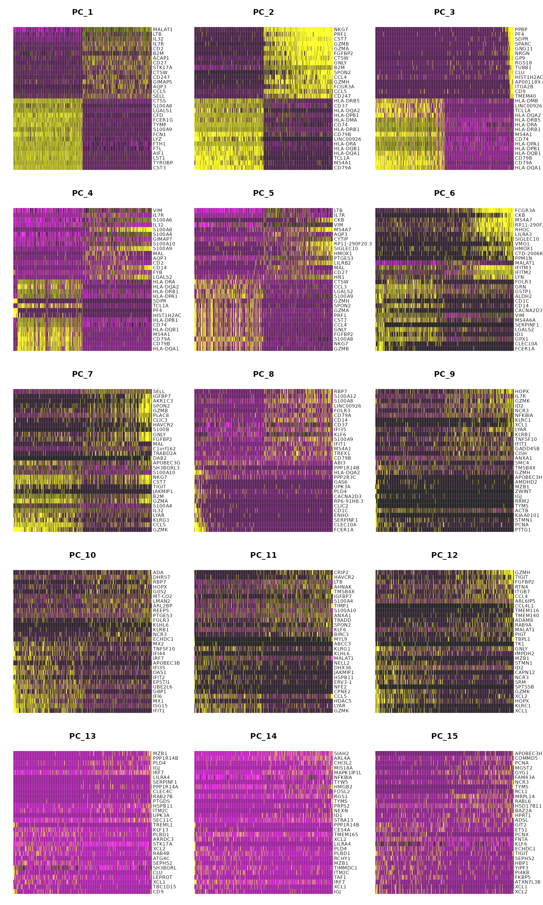
Determine the ‘dimensionality’ of the dataset
To overcome the extensive technical noise in any single feature for scRNA-seq data, Seurat clusters cells based on their PCA scores, with each PC essentially representing a ‘metafeature’ that combines information across a correlated feature set. The top principal components therefore represent a robust compression of the dataset. However, how many components should we choose to include? 10? 20? 100?
In Macosko et al, we implemented a resampling test inspired by the JackStraw procedure. While still available in Seurat, this is a slow and computationally expensive procedure, and we is no longer routinely used in single cell analysis.
An alternative heuristic method generates an elbow plot: a ranking of
principle components based on the percentage of variance explained by
each one (ElbowPlot() function). In this example, we can
observe an ‘elbow’ around PC9-10, suggesting that the majority of true
signal is captured in the first 10 PCs.
ElbowPlot(pbmc)
Identifying the true dimensionality of a dataset can be
challenging/uncertain. We therefore suggest these multiple approaches
for users. The first is more supervised, exploring PCs to determine
relevant sources of heterogeneity, and could be used in conjunction with
GSEA, for example; the second, (ElbowPlot); the third is a
heuristic that is commonly used, and can be calculated instantly. In
this example, we might have been justified in choosing anything between
PC 7-12 as a cutoff.
We chose 10 here, but encourage users to consider the following:
- Dendritic cell and NK aficionados may recognize that genes strongly associated with PCs 12 and 13 define rare immune subsets (i.e. MZB1 is a marker for plasmacytoid DCs). However, these groups are so rare, they are difficult to distinguish from background noise for a dataset of this size without prior knowledge.
- We encourage users to repeat downstream analyses with a different number of PCs (10, 15, or even 50!). As you will observe, the results often do not differ dramatically.
- We advise users to err on the higher side when choosing this parameter. For example, performing downstream analyses with only 5 PCs does significantly and adversely affect results.
Cluster the cells
Seurat applies a graph-based clustering approach, building upon initial strategies in (Macosko et al). Importantly, the distance metric which drives the clustering analysis (based on previously identified PCs) remains the same. However, our approach to partitioning the cellular distance matrix into clusters has dramatically improved. Our approach was heavily inspired by recent manuscripts which applied graph-based clustering approaches to scRNA-seq data [SNN-Cliq, Xu and Su, Bioinformatics, 2015] and CyTOF data [PhenoGraph, Levine et al., Cell, 2015]. Briefly, these methods embed cells in a graph structure - for example a K-nearest neighbor (KNN) graph, with edges drawn between cells with similar feature expression patterns, and then attempt to partition this graph into highly interconnected ‘quasi-cliques’ or ‘communities’.
As in PhenoGraph, we first construct a KNN graph based on the
Euclidean distance in PCA space, and refine the edge weights between any
two cells based on the shared overlap in their local neighborhoods
(Jaccard similarity). This step is performed using the
FindNeighbors() function, and takes as input the previously
defined dimensionality of the dataset (first 10 PCs).
To cluster the cells, we next apply modularity optimization
techniques such as the Louvain algorithm (default), SLM [SLM, Blondel
et al., Journal of Statistical Mechanics], or the Leiden
algorithm Traag et
al., Scientific Reports, 2019, to iteratively group cells
together, with the goal of optimizing the standard modularity function.
The FindClusters() function implements this procedure, and
contains a resolution parameter that sets the ‘granularity’ of the
downstream clustering, with increased values leading to a greater number
of clusters. We find that setting this parameter between 0.4-1.2
typically returns good results for single-cell datasets of around 3K
cells. Optimal resolution often increases for larger datasets. The
clusters can be found using the Idents() function.
pbmc <- FindNeighbors(pbmc, dims = 1:10)
pbmc <- FindClusters(pbmc, resolution = 0.5)
## Modularity Optimizer version 1.3.0 by Ludo Waltman and Nees Jan van Eck
##
## Number of nodes: 2638
## Number of edges: 95927
##
## Running Louvain algorithm...
## Maximum modularity in 10 random starts: 0.8728
## Number of communities: 9
## Elapsed time: 0 seconds## AAACATACAACCAC-1 AAACATTGAGCTAC-1 AAACATTGATCAGC-1 AAACCGTGCTTCCG-1
## 2 3 2 1
## AAACCGTGTATGCG-1
## 6
## Levels: 0 1 2 3 4 5 6 7 8Run non-linear dimensional reduction (UMAP / t-SNE)
Seurat offers several non-linear dimensional reduction techniques, such as t-SNE and UMAP, to visualize and explore these datasets. The goal of these algorithms is to learn underlying structure in the dataset, in order to place similar cells together in low-dimensional space. Therefore, cells that are grouped together within graph-based clusters determined above should co-localize on these dimension reduction plots.
While we and others have routinely found 2D visualization techniques like t-SNE and UMAP to be valuable tools for exploring datasets, all visualization techniques have limitations, and cannot fully represent the complexity of the underlying data. In particular, these methods aim to preserve local distances in the dataset (i.e. ensuring that cells with very similar gene expression profiles co-localize), but often do not preserve more global relationships. We encourage users to leverage techniques like UMAP for visualization, but to avoid drawing biological conclusions solely on the basis of visualization techniques.
pbmc <- RunUMAP(pbmc, dims = 1:10)
# note that you can set `label = TRUE` or use the LabelClusters function to help label
# individual clusters
DimPlot(pbmc, reduction = "umap")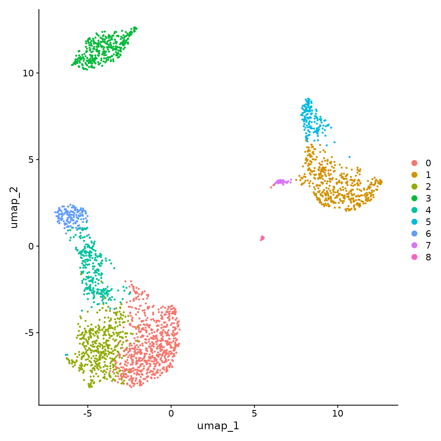
You can save the object at this point so that it can easily be loaded back in without having to rerun the computationally intensive steps performed above, or easily shared with collaborators.
saveRDS(pbmc, file = "../output/pbmc_tutorial.rds")Finding differentially expressed features (cluster biomarkers)
Seurat can help you find markers that define clusters via
differential expression (DE). By default, it identifies positive and
negative markers of a single cluster (specified in
ident.1), compared to all other cells.
FindAllMarkers() automates this process for all clusters,
but you can also test groups of clusters vs. each other, or against all
cells.
In Seurat v5, we use the presto package (as described here and
available for installation here), to
dramatically improve the speed of DE analysis, particularly for large
datasets. For users who are not using presto, you can examine the
documentation for this function (?FindMarkers) to explore
the min.pct and logfc.threshold parameters,
which can be increased in order to increase the speed of DE testing.
# find all markers of cluster 2
cluster2.markers <- FindMarkers(pbmc, ident.1 = 2)
head(cluster2.markers, n = 5)
## p_val avg_log2FC pct.1 pct.2 p_val_adj
## IL32 2.892340e-90 1.3070772 0.947 0.465 3.966555e-86
## LTB 1.060121e-86 1.3312674 0.981 0.643 1.453850e-82
## CD3D 8.794641e-71 1.0597620 0.922 0.432 1.206097e-66
## IL7R 3.516098e-68 1.4377848 0.750 0.326 4.821977e-64
## LDHB 1.642480e-67 0.9911924 0.954 0.614 2.252497e-63
# find all markers distinguishing cluster 5 from clusters 0 and 3
cluster5.markers <- FindMarkers(pbmc, ident.1 = 5, ident.2 = c(0, 3))
head(cluster5.markers, n = 5)
## p_val avg_log2FC pct.1 pct.2 p_val_adj
## FCGR3A 8.246578e-205 6.794969 0.975 0.040 1.130936e-200
## IFITM3 1.677613e-195 6.192558 0.975 0.049 2.300678e-191
## CFD 2.401156e-193 6.015172 0.938 0.038 3.292945e-189
## CD68 2.900384e-191 5.530330 0.926 0.035 3.977587e-187
## RP11-290F20.3 2.513244e-186 6.297999 0.840 0.017 3.446663e-182
# find markers for every cluster compared to all remaining cells, report only the positive
# ones
pbmc.markers <- FindAllMarkers(pbmc, only.pos = TRUE)
pbmc.markers %>%
    group_by(cluster) %>%
    dplyr::filter(avg_log2FC > 1)
## # A tibble: 7,019 × 7
## # Groups: cluster [9]
## p_val avg_log2FC pct.1 pct.2 p_val_adj cluster gene
## <dbl> <dbl> <dbl> <dbl> <dbl> <fct> <chr>
## 1 3.75e-112 1.21 0.912 0.592 5.14e-108 0 LDHB
## 2 9.57e- 88 2.40 0.447 0.108 1.31e- 83 0 CCR7
## 3 1.15e- 76 1.06 0.845 0.406 1.58e- 72 0 CD3D
## 4 1.12e- 54 1.04 0.731 0.4 1.54e- 50 0 CD3E
## 5 1.35e- 51 2.14 0.342 0.103 1.86e- 47 0 LEF1
## 6 1.94e- 47 1.20 0.629 0.359 2.66e- 43 0 NOSIP
## 7 2.81e- 44 1.53 0.443 0.185 3.85e- 40 0 PIK3IP1
## 8 6.27e- 43 1.99 0.33 0.112 8.60e- 39 0 PRKCQ-AS1
## 9 1.16e- 40 2.70 0.2 0.04 1.59e- 36 0 FHIT
## 10 1.34e- 34 1.96 0.268 0.087 1.84e- 30 0 MAL
## # ℹ 7,009 more rowsSeurat has several tests for differential expression which can be set with the test.use parameter (see our DE vignette for details). For example, the ROC test returns the ‘classification power’ for any individual marker (ranging from 0 - random, to 1 - perfect).
cluster0.markers <- FindMarkers(pbmc, ident.1 = 0, logfc.threshold = 0.25, test.use = "roc", only.pos = TRUE)We include several tools for visualizing marker expression.
VlnPlot() (shows expression probability distributions
across clusters), and FeaturePlot() (visualizes feature
expression on a tSNE or PCA plot) are our most commonly used
visualizations. We also suggest exploring RidgePlot(),
CellScatter(), and DotPlot() as additional
methods to view your dataset.
# you can plot raw counts as well
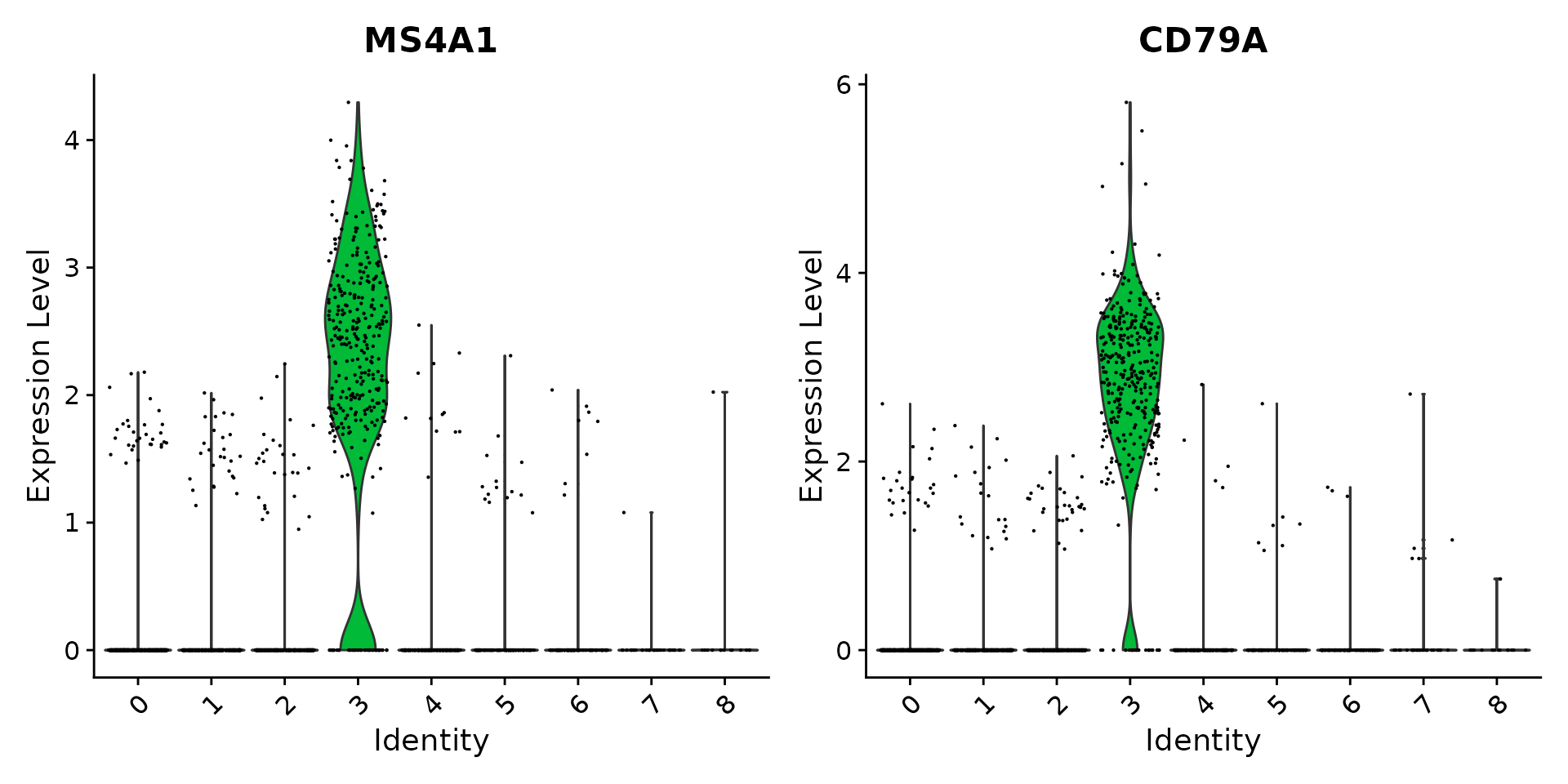
VlnPlot(pbmc, features = c("NKG7", "PF4"), slot = "counts", log = TRUE)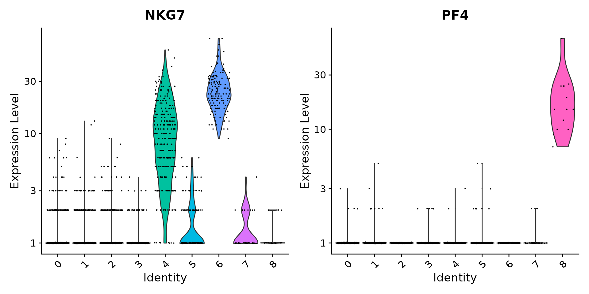
FeaturePlot(pbmc, features = c("MS4A1", "GNLY", "CD3E", "CD14", "FCER1A", "FCGR3A", "LYZ", "PPBP",
    "CD8A"))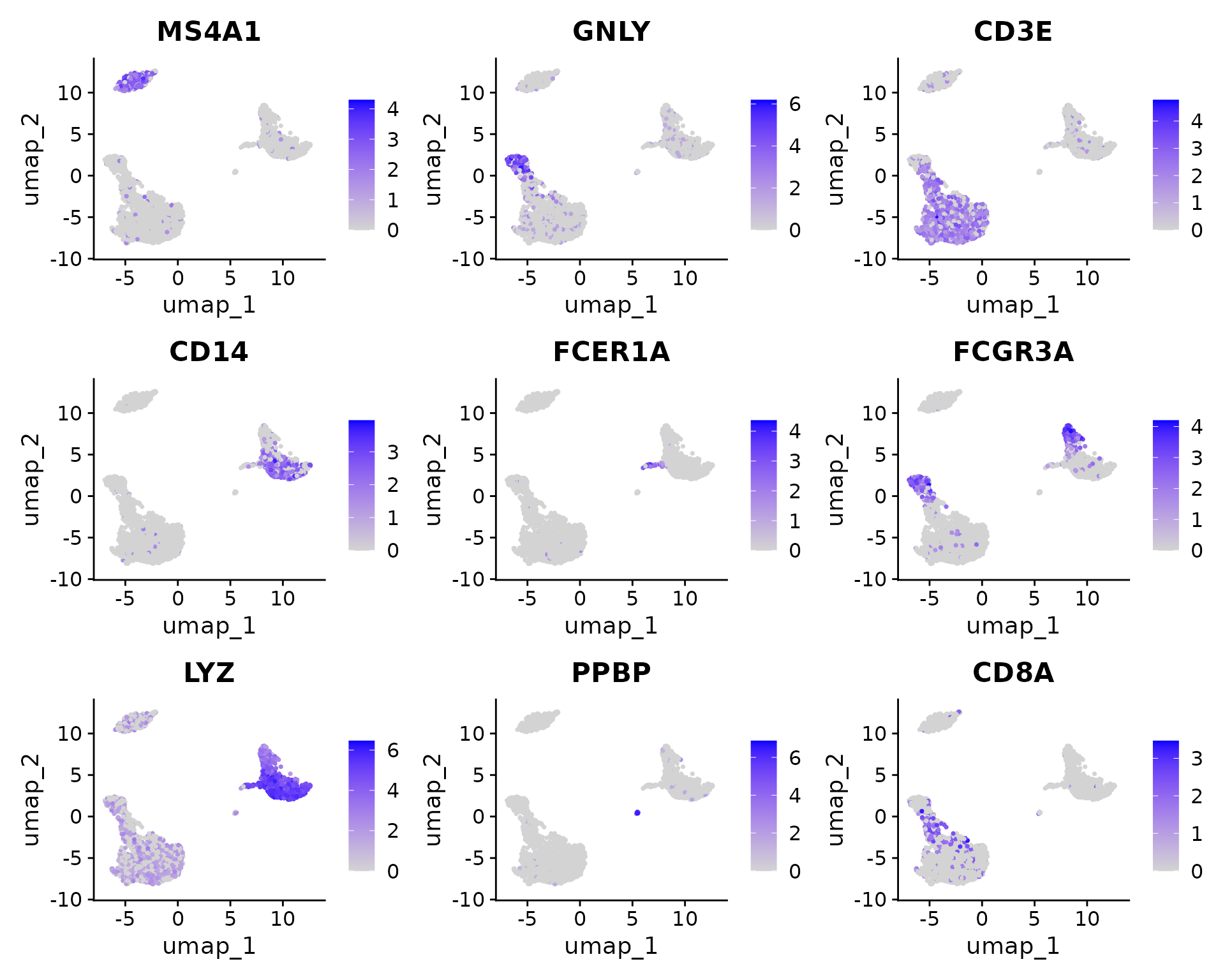
DoHeatmap() generates an expression heatmap for given cells
and features. In this case, we are plotting the top 10 markers (or all
markers if less than 10) for each cluster.
pbmc.markers %>%
    group_by(cluster) %>%
    dplyr::filter(avg_log2FC > 1) %>%
    slice_head(n = 10) %>%
    ungroup() -> top10
DoHeatmap(pbmc, features = top10$gene) + NoLegend()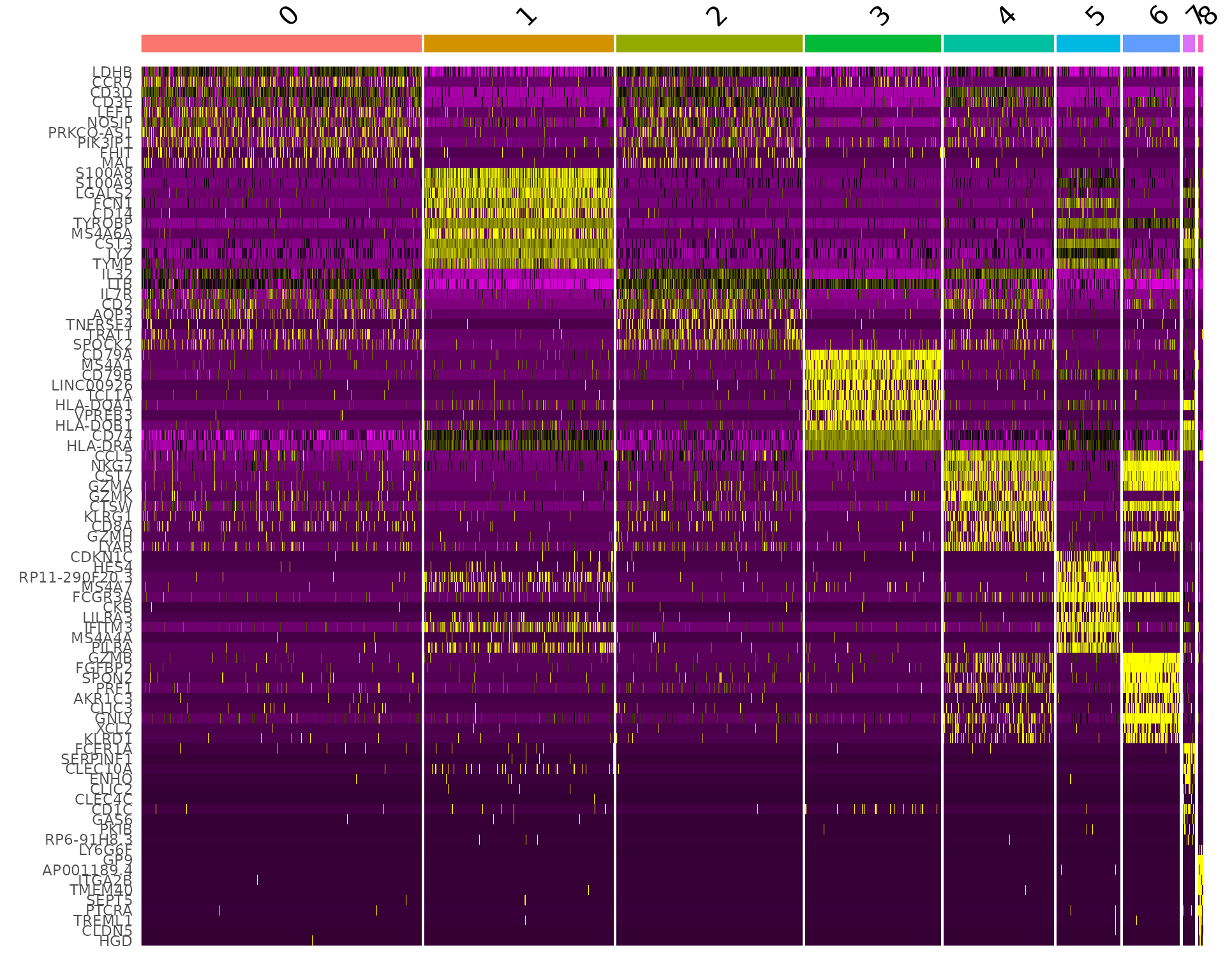
Assigning cell type identity to clusters
Fortunately in the case of this dataset, we can use canonical markers to easily match the unbiased clustering to known cell types:
| Cluster ID | Markers | Cell Type |
|---|---|---|
| 0 | IL7R, CCR7 | Naive CD4+ T |
| 1 | CD14, LYZ | CD14+ Mono |
| 2 | IL7R, S100A4 | Memory CD4+ |
| 3 | MS4A1 | B |
| 4 | CD8A | CD8+ T |
| 5 | FCGR3A, MS4A7 | FCGR3A+ Mono |
| 6 | GNLY, NKG7 | NK |
| 7 | FCER1A, CST3 | DC |
| 8 | PPBP | Platelet |
new.cluster.ids <- c("Naive CD4 T", "CD14+ Mono", "Memory CD4 T", "B", "CD8 T", "FCGR3A+ Mono",
    "NK", "DC", "Platelet")
names(new.cluster.ids) <- levels(pbmc)
pbmc <- RenameIdents(pbmc, new.cluster.ids)
DimPlot(pbmc, reduction = "umap", label = TRUE, pt.size = 0.5) + NoLegend()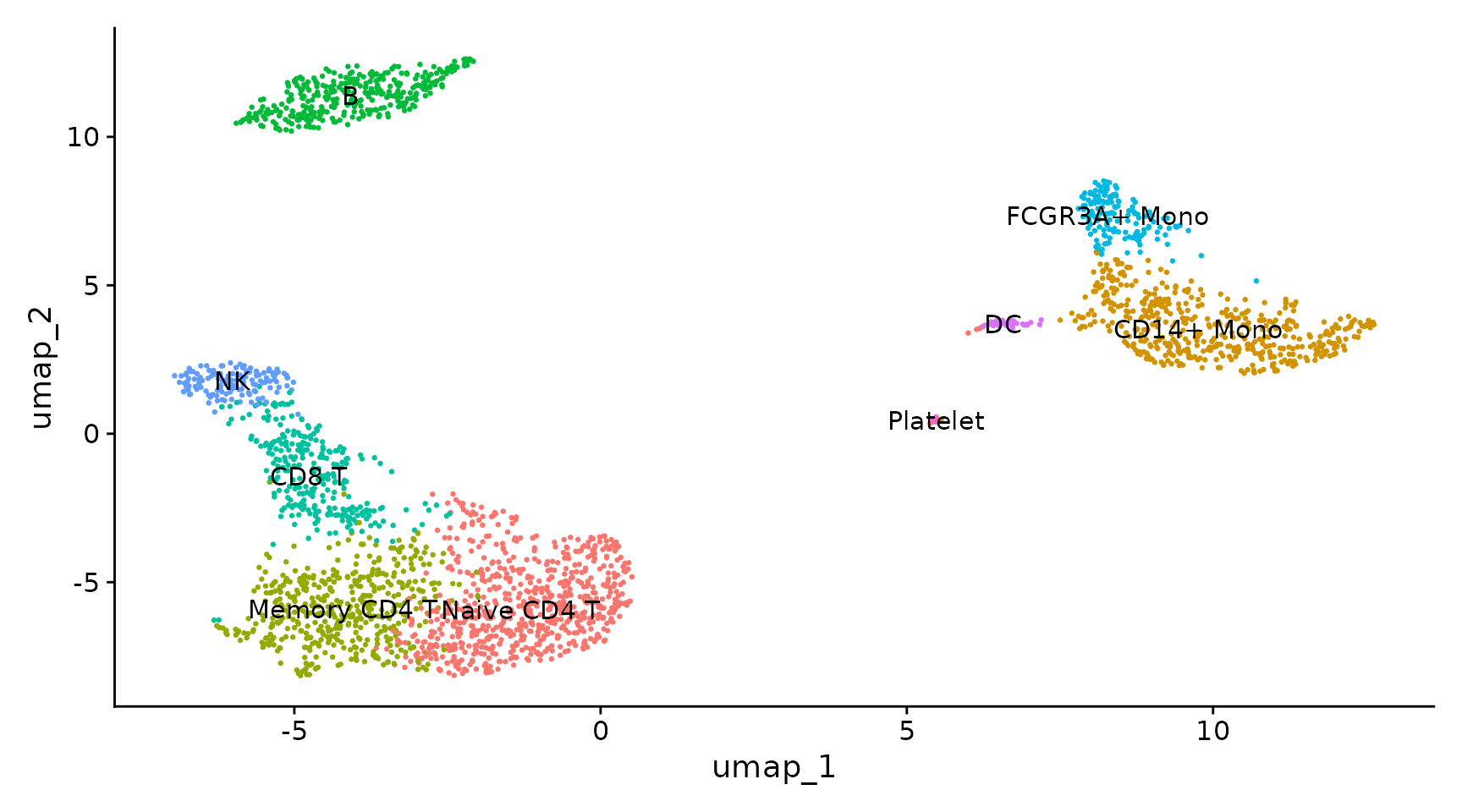
library(ggplot2)
plot <- DimPlot(pbmc, reduction = "umap", label = TRUE, label.size = 4.5) + xlab("UMAP 1") + ylab("UMAP 2") +
    theme(axis.title = element_text(size = 18), legend.text = element_text(size = 18)) + guides(colour = guide_legend(override.aes = list(size = 10)))

# ggsave(filename = '../output/images/pbmc3k_umap.jpg', height = 7, width = 12, plot = plot,
# quality = 50)
saveRDS(pbmc, file = "../output/pbmc3k_final.rds")Session Info
## R version 4.5.2 (2025-10-31)
## Platform: x86_64-pc-linux-gnu
## Running under: Ubuntu 24.04.4 LTS
##
## Matrix products: default
## BLAS:   /usr/lib/x86_64-linux-gnu/openblas-pthread/libblas.so.3
## LAPACK: /usr/lib/x86_64-linux-gnu/openblas-pthread/libopenblasp-r0.3.26.so;  LAPACK version 3.12.0
##
## locale:
##  [1] LC_CTYPE=en_US.UTF-8       LC_NUMERIC=C
##  [3] LC_TIME=en_US.UTF-8        LC_COLLATE=en_US.UTF-8
##  [5] LC_MONETARY=en_US.UTF-8    LC_MESSAGES=en_US.UTF-8
##  [7] LC_PAPER=en_US.UTF-8       LC_NAME=C
##  [9] LC_ADDRESS=C               LC_TELEPHONE=C
## [11] LC_MEASUREMENT=en_US.UTF-8 LC_IDENTIFICATION=C
##
## time zone: Etc/UTC
## tzcode source: system (glibc)
##
## attached base packages:
## [1] stats     graphics  grDevices utils     datasets  methods   base
##
## other attached packages:
## [1] ggplot2_4.0.3      future_1.70.0      patchwork_1.3.2    Seurat_5.5.0
## [5] SeuratObject_5.4.0 sp_2.2-1           dplyr_1.2.0
##
## loaded via a namespace (and not attached):
##   [1] RColorBrewer_1.1-3     jsonlite_2.0.0         magrittr_2.0.5
##   [4] spatstat.utils_3.2-2   ggbeeswarm_0.7.3       farver_2.1.2
##   [7] rmarkdown_2.30         fs_2.1.0               ragg_1.5.1
##  [10] vctrs_0.7.1            ROCR_1.0-12            spatstat.explore_3.8-0
##  [13] htmltools_0.5.9        sass_0.4.10            sctransform_0.4.3
##  [16] parallelly_1.47.0      KernSmooth_2.23-26     bslib_0.10.0
##  [19] htmlwidgets_1.6.4      desc_1.4.3             ica_1.0-3
##  [22] plyr_1.8.9             plotly_4.12.0          zoo_1.8-15
##  [25] cachem_1.1.0           igraph_2.3.0           mime_0.13
##  [28] lifecycle_1.0.5        pkgconfig_2.0.3        Matrix_1.7-5
##  [31] R6_2.6.1               fastmap_1.2.0          fitdistrplus_1.2-6
##  [34] shiny_1.13.0           digest_0.6.39          tensor_1.5.1
##  [37] RSpectra_0.16-2        irlba_2.3.7            textshaping_1.0.5
##  [40] labeling_0.4.3         progressr_0.19.0       spatstat.sparse_3.1-0
##  [43] httr_1.4.8             polyclip_1.10-7        abind_1.4-8
##  [46] compiler_4.5.2         withr_3.0.2            S7_0.2.1
##  [49] fastDummies_1.7.6      R.utils_2.13.0         MASS_7.3-65
##  [52] tools_4.5.2            vipor_0.4.7            lmtest_0.9-40
##  [55] otel_0.2.0             beeswarm_0.4.0         httpuv_1.6.16
##  [58] future.apply_1.20.2    goftest_1.2-3          R.oo_1.27.1
##  [61] glue_1.8.0             nlme_3.1-168           promises_1.5.0
##  [64] grid_4.5.2             Rtsne_0.17             cluster_2.1.8.2
##  [67] reshape2_1.4.5         generics_0.1.4         gtable_0.3.6
##  [70] spatstat.data_3.1-9    R.methodsS3_1.8.2      tidyr_1.3.2
##  [73] data.table_1.18.2.1    utf8_1.2.6             spatstat.geom_3.7-3
##  [76] RcppAnnoy_0.0.23       ggrepel_0.9.8          RANN_2.6.2
##  [79] pillar_1.11.1          stringr_1.6.0          limma_3.66.0
##  [82] spam_2.11-3            RcppHNSW_0.6.0         later_1.4.8
##  [85] splines_4.5.2          lattice_0.22-7         survival_3.8-3
##  [88] deldir_2.0-4           tidyselect_1.2.1       miniUI_0.1.2
##  [91] pbapply_1.7-4          knitr_1.51             gridExtra_2.3
##  [94] scattermore_1.2        xfun_0.56              statmod_1.5.1
##  [97] matrixStats_1.5.0      stringi_1.8.7          lazyeval_0.2.3
## [100] yaml_2.3.12            evaluate_1.0.5         codetools_0.2-20
## [103] tibble_3.3.1           cli_3.6.6              uwot_0.2.4
## [106] xtable_1.8-8           reticulate_1.46.0      systemfonts_1.3.2
## [109] jquerylib_0.1.4        Rcpp_1.1.1-1.1         globals_0.19.1
## [112] spatstat.random_3.4-5  png_0.1-9              ggrastr_1.0.2
## [115] spatstat.univar_3.1-7  parallel_4.5.2         pkgdown_2.2.0
## [118] presto_1.0.0           dotCall64_1.2          listenv_0.10.1
## [121] viridisLite_0.4.3      scales_1.4.0           ggridges_0.5.7
## [124] purrr_1.2.1            rlang_1.2.0            cowplot_1.2.0
## [127] formatR_1.14